Scatter-plot using matplotlib python
Matplotlib : Scatter-plot
A scatter plot (also called a scatterplot, scatter graph, scatter chart, scattergram, or scatter diagram) is a type of plot or mathematical diagram using Cartesian coordinates to display values for typically two variables for a set of data. If the points are coded (color/shape/size), one additional variable can be displayed. The data are displayed as a collection of points, each having the value of one variable determining the position on the horizontal axis and the value of the other variable determining the position on the vertical axis.
In this Article we will create some basics of scatterplot using Matplotlib.pyplot .
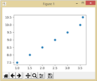
1 . Draw a scatterplot .
Output :
2. Changing color and size of plot.
# Matplotlib : Dynamic Coding
# scatterplot ...

# import library

import matplotlib.pyplot as plt

x_var = [1,1.5,2,2.5,3,3.5,3.6]
y_var = [7.5,8,8.5,9,9.5,10,10.5]

# plot the scatter for x_var and y_var
plt.scatter(x_var,y_var, s = 100 , c ="#CC0000",alpha = 1)

# disply the plotted scatter graph
plt.show()
Output :
3. Adding label and title .
# Matplotlib : Dynamic Coding
# scatterplot ...

# import library
import matplotlib.pyplot as plt

x_var = [1,1.5,2,2.5,3,3.5,3.6]
y_var = [7.5,8,8.5,9,9.5,10,10.5]

# plot the scatter for x_var and y_var
plt.scatter(x_var,y_var, s = 100 , c ="#CC0000",alpha = 1,label='Profit')
plt.legend()

# adding x and y axis labels
plt.xlabel('X axis')
plt.ylabel('Y axis')
# disply the plotted scatter graph
plt.show()
4. Multiple scatterplot .
# Matplotlib : Dynamic Coding
# scatterplot ...

# import library
import matplotlib.pyplot as plt

x1_var = [1,1.5,2,2.5,3,3.5,3.6]
y1_var = [7.5,8,8.5,9,9.5,10,10.5]

x2_var = [8,8.5,9,9.5,10,10.5,11]
y2_var = [3,3.5,3.7,4,4.5,5,5.2]

# plot the scatter for x1_var and y1_var
plt.scatter(x1_var,y1_var, s = 100 , c ="green",alpha = 1,label='Profit')

# plot the scatter for x2_var and y2_var
plt.scatter(x2_var,y2_var, s = 100 , c ="red",alpha = 1,label='Profit')
plt.legend()

# adding x and y axis labels
plt.xlabel('X axis')
plt.ylabel('Y axis')
# disply the plotted scatter graph .
plt.show()
Output :
Thank you .
This blog is contributed by Yogesh singh .
Please leave a feedback in comment section


No comments