

Matplotlib Bar Graphs
Bar Graph using python matplotlib.pyplot


OUTPUT :


alpha attribute is used for changing opacity of bar and grid lines and you can also change the axis from Y to X .
OUTPUT :
What is Bar Graph :
A bar chart or bar graph is a chart or graph that presents categorical data with rectangular bars with heights or lengths proportional to the values that they represent. The bars can be plotted vertically or horizontally.
A bar graph (also known as a bar chart or bar diagram) is a visual tool that uses bars to compare data among categories. A bar graph may run horizontally or vertically. The important thing to know is that the longer the bar, the greater its value.
Bar graphs consist of two axes. On a vertical bar graph, as shown above, the horizontal axis (or x-axis) shows the data categories. In this example, they are years. The vertical axis (or y-axis) is the scale. The colored bars are the data series.
Bar graphs have three key attributes:
- A bar diagram makes it easy to compare sets of data between different groups at a glance.
- The graph represents categories on one axis and a discrete value in the other. The goal is to show the relationship between the two axes.
- Bar charts can also show big changes in data over time.
Creating bar graphs / bar chart .
1. Simple Graph .
CODE :
# matplotlib : bar graph

import matplotlib.pyplot as plt

x = [2,5,4,8,10]
y = [7,3,4,11,2]

# plotting the canvas
plt.bar(x,y)
# showing the canvas / Graph
plt.show()
OUTPUT :
For creating Bar Graph we use bar method of pyplot class .
2. Adding title and labels in Bar Graph .
CODE :
# simple graph using matplotlib
import matplotlib.pyplot as plt
x = [2,5,8,9]
y = [4,6,9,10]

# ploting our canvas
plt.bar(x,y,label='Profit',width=.5)
# Adding title and label of axis
plt.title('Bar Graph')
plt.xlabel('Profit')
plt.ylabel('Sales')
plt.legend()

# showing what we plotted
plt.show()
OUTPUT :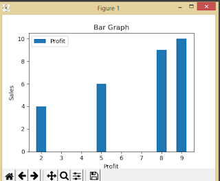
As you can see the xlabel and ylabel method is used for naming the axis and the title method is used for naming the title of bar graph and legend method is for the left top corner box which shows which color is for which value.
3. Multiple Bar Graph .
CODE :
import matplotlib.pyplot as plt
x1 = [2,5,8,9]
y1 = [4,6,9,10]

x2 = [3,4,10,6]
y2 = [7,1,5,4]

# ploting our canvas
plt.bar(x1,y1,label='bar 1')
plt.bar(x2,y2,label='bar 2')
# Adding title and label of axis
plt.title('Bar Graph')
plt.xlabel('Profit')
plt.ylabel('Sales')
plt.legend()

# showing what we plotted
plt.show()
4. Bar graph with string Data .
CODE :
import matplotlib.pyplot as plt
x = ['audi','bmw','maruti','tata']
y = [4,6,9,10]

# ploting our canvas
plt.bar(x,y,label='Profit',width=.5)
# Adding title and label of axis
plt.title('Bar Graph')
plt.xlabel('Company')
plt.ylabel('Sales')
plt.legend()

# showing what we plotted
plt.show()
OUTPUT :
5. Adding Grid lines in Bar graph .
CODE :
# Grid lines
import matplotlib.pyplot as plt

data = [23, 45, 56, 78, 213]

plt.bar(range(len(data)), data,color='royalblue', alpha=0.7)

plt.grid(color='#95a5a6', linestyle='--', linewidth=2, axis='y', alpha=0.5)
plt.show()
OUTPUT :
6. Stack chart / graph .
means one bar graph over other
CODE :
# stack Chart
import matplotlib.pyplot as plt

data1 = [23,85, 72, 43, 52]
data2 = [42, 35, 21, 16, 9]
plt.bar(range(len(data1)), data1)
plt.bar(range(len(data2)), data2, bottom=data1)
plt.show()
Resent post on matplotlib :
This blog is contributed by Yogesh singh .
Follow my instagram page


thanks brother
ReplyDelete